

Redesigning the Offer Creation Module
PM + Product Designer on the redesign of a key B2C/B2B SaaS billing flow. One reusable component for eight modals, a limit publishing cycle reduced from one month to one sprint, and shorter task completion time.
Context
The product is a subscription-based B2C/B2B SaaS service. The billing department consisted of four teams:
- payment processing and payment management
- subscriptions and offers
- limits management
- the external billing cabinet for users
I worked with the first three of the four teams. In close collaboration with a designer from the fourth team, I also helped shape shared processes where our areas of responsibility overlapped.
The limits list was a central part of the system and was used in 8 modal windows with different logic. User scenarios for these modals were not documented anywhere. Some knowledge holders had already moved to other teams and were no longer working on billing. That meant critical context existed in people’s heads, not in documents.
At some point, the business approved the development of a new billing system: a more flexible one that could adapt to quickly changing needs. This became the department’s main project, and my redesign of the offer creation modal existed within that larger effort.
Problem
The modals ran on legacy code. Any change required a lot of engineering time, so publishing new limits to production took about one month.
From a UX perspective, the sharpest pain was for sales managers. They created offers both during client calls and after them, often in large numbers during a single working day. The list contained more than 100 limits and stretched across 8-10 screens on a 14-inch laptop. Users searched for the right limit with Ctrl+F. After enabling it, they had to scroll down because the settings appeared below. During a call, this broke the rhythm of the conversation. In offline mode, it slowed down work, especially when a customer asked to add many different limits to a subscription.
Another layer of complexity came from hidden dependencies: some limits were organized in a hierarchy, with a parent limit and child limits that became available only when the parent was enabled. Visually, all limits looked the same. Limits without child entities existed as independent items.

My Role
Within the broader new billing project, tasks were distributed between teams, and I volunteered to curate the modal redesign project as PM. That meant combining two roles at the same time.
As Project Manager:
- Reported weekly to two stakeholders: Head of Engineering and Head of Product
- Managed my team, one full-stack engineer and one frontend engineer, while also maintaining communication with three other department teams and informing them about changes that could affect their subsystems
- Planned sprints and controlled priorities, aligning technical decisions with business goals without drifting into unnecessary complexity
As Product Designer:
- Ran the initial research and created the User Journey Map, documented for all modals for the first time
- Designed several solution options and tested them iteratively with interactive prototypes
- Handed the final solution to engineering through prototype code and supported users after launch
Research
There was no formal analytics for these modals. There were no counters, and scenarios had not been described. I built the measurement setup myself.
Coverage:
| Total participants | 29 people |
| Interview sessions | ~17 |
| Surveys | 2 waves |
| User groups | 6: sales, pre-sales, PO, PM, dev, customer support |
Different groups interacted with the modal differently:
- sales created and edited offers (14 people)
- customer support worked in view mode (9)
- PO/PM/dev used it rarely and situationally (6)
This became the basis for segmentation during testing.
To get baseline metrics for comparison, I manually measured task speed on the existing interface during interviews. I also collected self-reported data from users: some sales managers knew roughly how long it took them to create an offer for certain tasks. This gave us a starting point for later comparison with the new prototype results.
During the interviews, I built a User Journey Map in parallel. It had not existed in any form before. The map helped prioritize work, keep focus on the most important areas, and later support manual testing.
Process
1. Focus and Constraints
A full redesign and technical rebuild would have taken too much time and would have forced users to relearn the flow from scratch. I intentionally narrowed the problem list to one critical issue: the compactness and structure of the limits list.
In parallel, I decided that the component should be reusable. One implementation had to cover all 8 modals with different logic.
2. Design Solution: A Component on Top of Intergalactic DS
The new limits list was built on React + Intergalactic, the Semrush design system. I designed the limits list component specifically as something that would be embedded into existing environments. The rest of the modal stayed on the legacy stack. I used the design system as a foundation, but designed the visual model and behavior logic for this specific task.
I also justified the interaction patterns through research. NN/g describes progressive disclosure as a tool for data-dense interfaces: show only what is needed constantly on the first level, and move secondary details into disclosure. That matched the task exactly: sales needed fast search, while settings were needed only after a limit had already been selected.
Three key principles of the component:
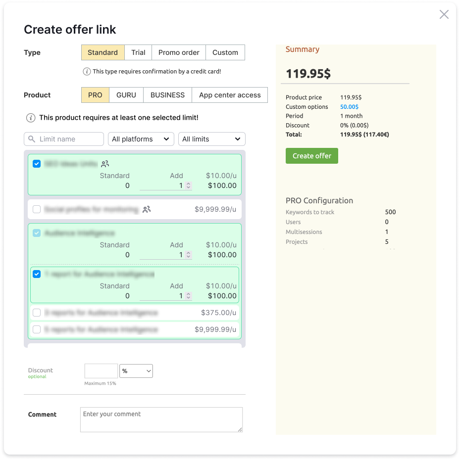
- List as a controlled structure: search plus clear states for every limit, such as added, not added, and unavailable, instead of an endless uniform scroll
- Progressive disclosure: the default row shows only the name and status; settings appear after enabling
- Visible dependencies and hierarchy: limits are grouped into parent-child relationships where those relationships exist; unavailable limits received a visual status with an explanation directly in the interface
Final solution for the limits list.
3. Interactive Prototype: Svelte + Tailwind
Testing static Figma mockups would not have given the accuracy we needed. Users had to really interact with a long dynamic list for us to see the difference. I built a working prototype myself: I took the base HTML from the existing page and implemented the new list model with Svelte + Tailwind.
On top of the prototype, I added three custom measurement tools:
- Timer - started when the task began and stopped when it was completed, which gave precise task time without the observer effect
- Click map - showed where users clicked, where they got lost, and what they ignored
- Scroll map - showed viewing order and helped check whether the element order was correct
The prototype was published as a static page on GitLab Pages and sent to participants before the session. During interviews, they immediately worked with a real interface.
4. Iterations
I tested 3 layout versions. The first two received similar feedback: the list became a little more compact, but there was still too much information and it was still not obvious enough. The settings for each limit took up space regardless of whether users needed them at that moment.
In the third version, I reached the right balance: in the default state, a limit shows only its name and status, and settings appear only after it is enabled.
The first screen now showed 3-8 ordered limits, depending on state, instead of the earlier 10-15 tightly packed items.
First version
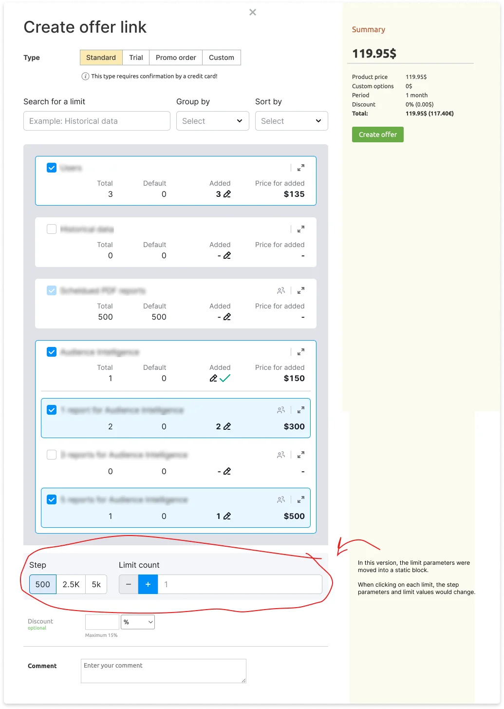
Some of the problems found:
- The main issue was that users did not notice the settings panel at all and did not understand how to edit limit parameters
- The limits themselves also took up too much space
Second version
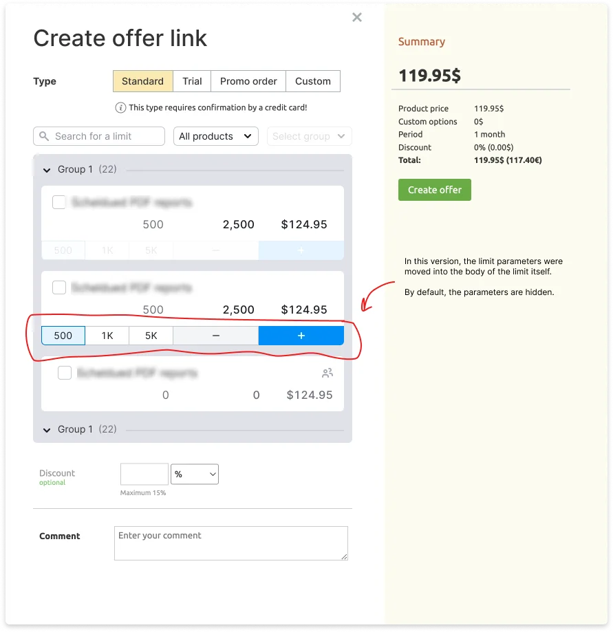
Some of the problems found:
- Limits with parameters inside the limit card consumed vertical space
- There was no room to add manual input for quantity values, and without this option, some tasks took longer because users had to click many times to enter the needed quantity
Refinements
After the final structure of the module was defined, I refined the logic needed for other modals.
I kept this logic in mind and in Figma sketches while designing the shared list module.
For example, in the modal for viewing and editing a user’s subscription and limits, users needed the ability to leave comments for each edited limit. A single comment field for all limits would have been technically expensive to implement.
Old version
Modal for viewing and editing a user’s subscription with all limits included in that subscription.
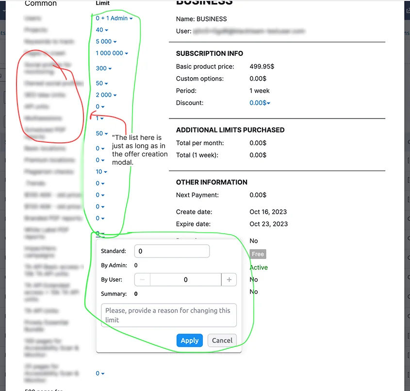
New version
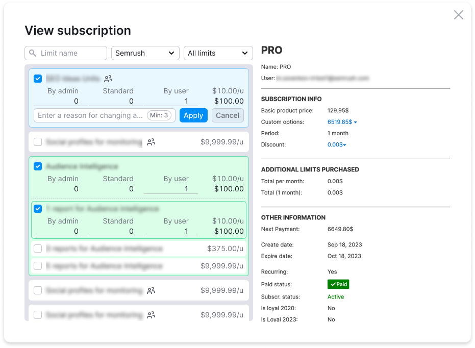
In the other modals, only the display and behavior logic differed. The module itself was visually the same, so they are not shown here.
5. Handoff to Engineering
The engineers received an interactive prototype with code. Most of the state logic had already been implemented and tested with users. This made it possible to hand over a working implementation instead of describing behavior in text. I finished documenting all states and edge cases after development had already started, not before. That saved time on design artifact handoff. One design component was integrated into all modals, replacing scattered legacy implementations.
Results
Product Impact
| Limit publishing cycle to production | ~1 month -> 1 sprint |
| Average task completion time | Roughly halved - about 4:20 down to about 2:40 (see the caveat below) |
| Flows covered by one component | 8: Create/View offer, Create/View invoice, Create/View additional invoice, Add free subscription, View/edit subscription |
| First screen density | 3-8 ordered limits instead of 10-15 tightly packed items |
Caveat on the task-time figure. These numbers were taken in production, but they are rough averages over roughly 12 people, not a controlled measurement. Quoting them to the second would imply a rigour the measurement did not have. The defensible claim is the method rather than the digits: there was no analytics on these modals at all, so I built the baseline from scratch by manually timing tasks during interviews and collecting self-reported times from sales managers who knew their own averages. Building measurement where none existed is the part that mattered.
User Impact
~70% of participants in the final test completed tasks confidently and within the target time. 30% noted that the new pattern felt unfamiliar, without criticizing the functionality itself. It was simply a change to their familiar workflow.
I collected the comparison baseline in advance: I manually measured time on the old interface and gathered data from users themselves, some of whom knew their average task time. This made it possible to compare indicators, rather than just judge subjectively whether the new version was “better” or “worse.”
Research Process
There were no formal flow metrics before the project. I built measurement from scratch: custom measurements in the prototype produced objective behavioral data that would otherwise have been impossible to get. This became the main argument when presenting the final solution to stakeholders and other participants.
After launch, I spent a month in a support role: collecting feedback, recording a video guide, and helping other teams understand the new logic.
Challenges and Takeaways
Timeline Shift
After five months of work, it became clear that the original estimate was inaccurate. Hidden dependencies in the legacy code surfaced only during implementation because there had been no deep technical research at the start. The timeline shifted by three months. I had to explain the situation to the Head of Engineering and Head of Product, justify the new timeline, and preserve trust, because other teams depended on our timeline. This was the hardest moment of the project. After the re-estimate, we delivered without further shifts.
Bugs After Launch
After release, we found about 4 bugs. Some relationships between limits had not been accounted for because some tests were missing and there was no documentation for the logic. The team fixed them quickly while the code context was still fresh. I acted as a connector: collecting user feedback and helping prioritize fixes.
Key Takeaways
- Without measurement, there is no comparison. Without comparison, there is no argument.
- Sometimes technical research at the start can make a project more predictable.
- In some contexts, unification is more expensive at the start, but cheaper in long-term maintenance.