

Closing the Legacy Payment Form
Project Manager of record and Product Designer on a 38-week migration from a 15-year-old payment form to a new one, across four billing teams in a B2C/B2B SaaS billing product. Scenario documentation, a billing design kit, and a three-experiment cycle - failure, AA test, rerun - delivered against a success criterion of no conversion loss.
Closed a 15-year-old payment form with no conversion loss – against a success criterion set before the project started.
Context
The product is a subscription-based B2C/B2B SaaS service. The billing department consisted of four teams: payment processing and payment management, subscriptions and offers, limits management, and the external billing cabinet for users.
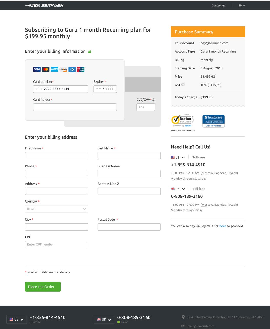
At the start of the project to close the old payment form, the product had two payment forms:
- an old, long form with a large amount of data to display and scenarios such as subscription upgrades and downgrades
- a new, shorter form that had been created to replace the old one, but covered only one payment scenario
Most payments still went through the old form. As part of a broader billing modernization effort, the decision was made to close the old form completely and move all users to the new one.
Problem
The old form had UX issues that cost the company money: users could accidentally overwrite an existing subscription with accumulated limits by buying a new subscription. The new form, in turn, did not support the main payment scenarios or the different upgrade and downgrade situations.
The task was not simply to “make it look better.” We had to close the functional gap between the two forms and make the transition safely, without losing conversion.
The business case was maintenance cost and a real defect, not incremental revenue. So success was defined up front as no conversion loss, not as a conversion win. That distinction mattered: the long form carried only about 3,100 weekly visitors, and demanding a provable uplift on that traffic would have stalled a migration that was justified on other grounds.
The project ran from June 2024 to March 2025 – 38 planned weeks, across four billing teams.
My Role
I was Project Manager of record on this project and did the design work on it at the same time. As PM that meant keeping stakeholders informed about status, running weekly syncs with two Product Owners, a designer from an adjacent team, and the team itself, and tracking progress on the roadmap and in other channels.
As Product Designer:
- Documented all existing payment scenarios across the old and new forms - upgrade, downgrade, buying additional limits - and brought them together into one shared map for the first time
- Split responsibility zones on the form between teams so the ownership was visually clear
- Designed a draft of the final form structure and aligned it with all participants
- Agreed with a designer from an adjacent team on how modules would be split in Figma: who would build what, how components would be handed over to other teams, and how they would be approved
- Together with another designer, created a billing design kit based on the design system, with configurable components for different states, such as “has card” and “no card”
- Integrated the adjacent designer’s completed modules into the shared scenario map
- At every development stage, manually tested scenarios together with QA and the teams using the map, then documented and aligned fixes
Research
Starting data at the beginning of the project:
- ~3,100 average weekly visitors on the long payment form, excluding saved-card flows
- Visit -> Submit conversion: 61.42%
- Visit -> Payment + Trial conversion: 53.63%
- Target MDE, minimum detectable effect: +2% for each metric
The low traffic on the long form is the constraint that shaped everything that followed. At ~3,100 weekly visitors, a statistically strong experiment on the bottom of this funnel is slow and hard, which is exactly why the project was gated on parity rather than on an uplift.
A note on projections: the planning documents for this project also carried a forecast of roughly 25 additional weekly payments if the targets were met. That was a pre-project estimate used to size the work, not a measured outcome, and it is not claimed as a result anywhere in this case study.
Process
1. Documenting Scenarios
The first step was to collect all scenarios from both forms into one map. Before that, nobody had documented the scenarios for both forms in one place. The large cases were understood intuitively, and some cases did not appear anywhere at all.
I started by documenting every scenario and turning them into a shared map. After that, the map became a common language between teams: for splitting areas of responsibility, aligning designs, and manually testing flows at different stages.
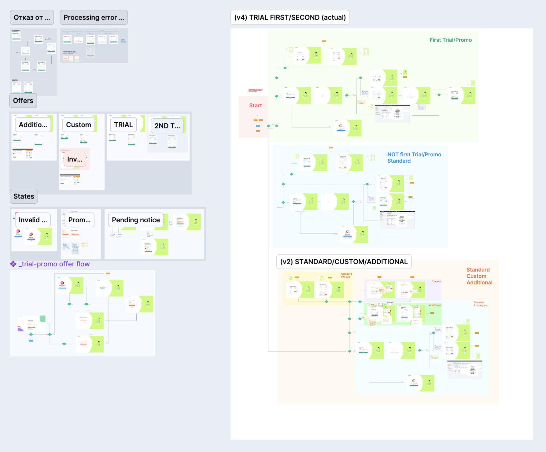
The last approved version of the map. Everything was later moved into the current files. This remained as a working draft.
2. Design Kit and Component Architecture
In parallel, another designer and I agreed on how to build public components for delivery to other teams. Each designer implemented their own modules independently, then we did a basic review and alignment together.
The result was a billing kit - a set of components with configurable states for different integration contexts.
3. Design Testing
We tested quickly and iteratively: state screenshots in Slack, emoji voting inside the design team, and focused checks with sales and customer success.
The format was chosen deliberately: we did not need a perfect form. We needed a working replacement for the old one.
4. Development and Rollout
The old form lived on a legacy stack, and that set the pace for the entire development process. As each module was built on the frontend according to the designs, QA, the teams, and I manually walked through the scenario map and tested the flows.
We moved to production gradually, through experiments, with special attention to critical scenarios.
Experiments
Experiment 1 - Failure
The first A/B test was launched for users trying trial subscriptions.
| Metric | Original | Variant 1 | Delta |
|---|---|---|---|
| Visit payment form | 3,731 | 4,630 | +11.25% |
| Submit trying | 2,357 | 3,032 | +15.32% |
| Submit success | 2,317 | 2,811 | +8.76% |
| First Payments | 78 | 61 | -29.89% |
| Paid Users | 377 | 389 | -7.5% |
The variant attracted users to the form and increased payment attempts, but conversion to a real payment dropped by 30%. Something was blocking users at the final step.
Nobody believed the result. Throughout the whole experiment, the experimental group also consistently had more participants. We formed a hypothesis that users might be re-registering to get into the desired variant, or that the testing system itself was configured incorrectly. But we could not find confirmation for the first hypothesis.
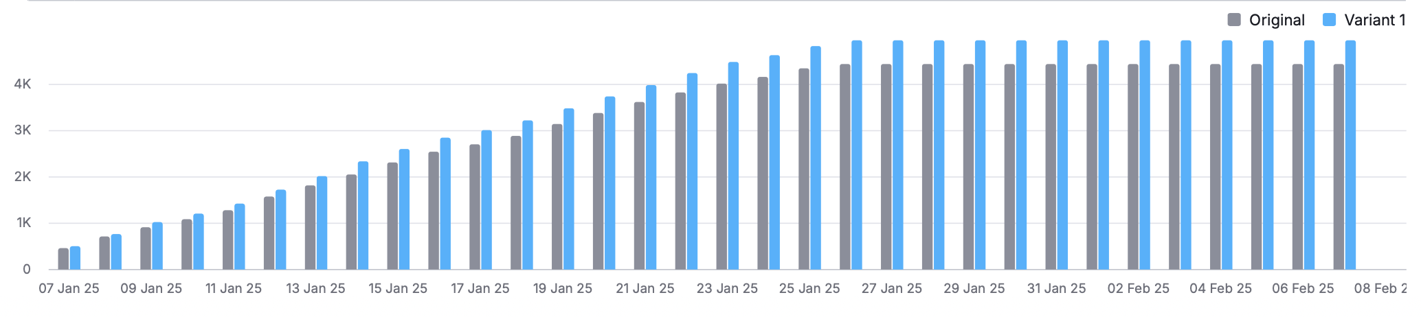
The chart shows stable differences between the groups.
AA Test - Checking the System
Before the next iteration, we launched an AA test: both groups saw the same interface. The goal was to verify randomization and experiment settings.
| Metric | Original | Variant 1 | Delta |
|---|---|---|---|
| Submit attempt | 9,794 | 9,902 | +1.59% |
| Submit success | 7,378 | 7,447 | +1.42% |
| Trial | 4,185 | 4,169 | +0.1% |
| First payment | 3 | 1 | -66.51%* |
The difference in key metrics did not exceed 1.5%, which was within statistical noise. The re-registration hypothesis was not confirmed. The system was working correctly.
Experiment 2 - Rerun
After confirming the setup, we launched the second A/B test. It ran for three weeks and was stopped at the end of March 2025.
| Metric | Original | Variant 1 | Delta |
|---|---|---|---|
| Trials | 2,276 | 2,416 | -0.09% |
| Paid Users | 88 | 107 | +14.44% |
| First Payments | 13 | 21 | +52.04% |
| Submit trying | 2,762 | 3,103 | +5.74% |
| Submit success | 2,675 | 2,869 | +0.95% |
Read those percentages against the absolute numbers. +52.04% on First Payments is 13 conversions against 21, and +14.44% on Paid Users is 88 against 107. On a form with ~3,100 weekly visitors, that is what three weeks buys. The experiment’s own results summary does not call this a win either: it states that the new version demonstrated similar conversion rates.
So the honest reading is parity, not uplift – and parity was the success criterion. The deployment decision was made together with the analytics team on that basis, not on the headline percentage. I could put “+52% first payments” at the top of this page; it would be the same data, described dishonestly, and it would not survive the first question about sample size.
This time, the user distribution between groups was normal. We never found the reason for the difference in the first experiment.
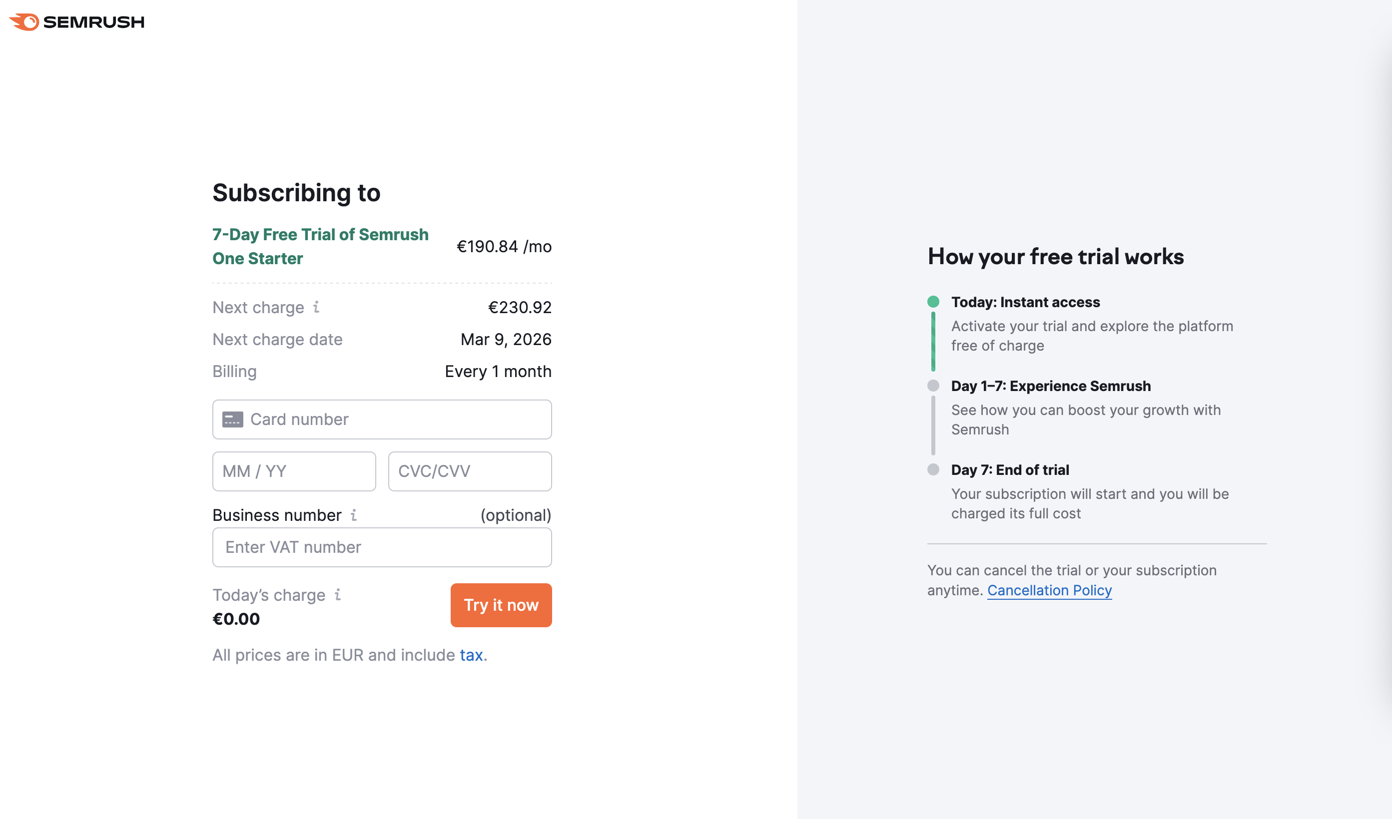
Final form, trial scenario
Results
The project closed at 100% against its goal, with a delay caused by the failed first experiment.
| Result | |
|---|---|
| The 15-year-old payment form | Closed. No redirects to it remained from the upgrade or purchase widgets |
| Success criterion – no conversion loss | Met |
| Payment form maintenance | Two places -> one, roughly halving the cost of every tax, processing and UI change |
| Scenario coverage on the new form | All user flows: purchases, additional and custom offers, trial offers with promo codes, upgrades and downgrades with and without a saved card, pending subscriptions after a failed rebill, repeat trials, promo code validation, card update |
| Duration | 38 planned weeks, Jun 2024 - Mar 2025 |
The design artifacts included a map of all payment scenarios, documented for the first time, and a billing design kit with reusable components that other teams and designers could configure for their own scenarios.
The headline here is not a conversion number. It is that a 15-year-old form carrying most of the payment traffic was closed across four teams without breaking conversion, and that the cost of every future change to the payment surface was halved.
Challenges
Old Form on a Legacy Stack
A significant part of the work was technical rather than purely design work. The legacy stack meant hidden dependencies and a lot of accumulated logic that had to be untangled. This required constant coordination between teams.
Failed First Experiment
A 30% drop in First Payments while user activity increased was a non-trivial result that did not match the team’s intuition. It required an AA test to restore trust in the data and an additional iteration before launching the next experiment.
Key Takeaways
- User activity does not equal readiness to pay. Growth in payment attempts can hide a problem at the final step of the funnel, so it is important to follow the data all the way through.
- A failed test is still a result. The first experiment gave us a clear hypothesis for the next iteration and revealed a barrier that would have stayed invisible without the test.
- AA tests build trust. When the data is in doubt, checking the measurement system is not wasted time. It is a necessary step before the next decision.
- A percentage without its absolute numbers is not a result. +52% on 13 conversions and +5% on a six-figure sample are not the same kind of claim, and the difference is the whole job. Define success against the actual business case, then report what the data supports.