Choosing a District for a Jewelry Workshop in Saint Petersburg: A Data Walkthrough
How I collected and analyzed data from Rosstat, mapped the competitive landscape, built a district scoring model, and then admitted why all of that was still not enough for a real location decision.
Context
A friend wanted to help someone he knew who was planning to open a jewelry workshop in Saint Petersburg. He asked whether I wanted to dig into the data and see if we could help somehow. I said: “YES, let’s dig!”
At the start, we had coordinates for 354 existing workshops as of early 2025, collected from Yandex Maps, along with their status (open / closed), rating, and working hours. I had only a vague idea of where to begin and what the final result should look like. So I jumped straight into implementation. Not the first time going in blind, and honestly, it can be fun.
- Stack: Python, Pandas, Folium, Plotly, GeoPandas, Google Sheets, Tableau
- Data: Yandex Maps (organizations), Rosstat (population, salaries, housing commissioning, age structure), OpenStreetMap (GeoJSON boundaries)
- Scope: 18 districts, 111 municipalities, data range from 2018 to 2025
Artifacts
Part 1. A Series of Dead Ends
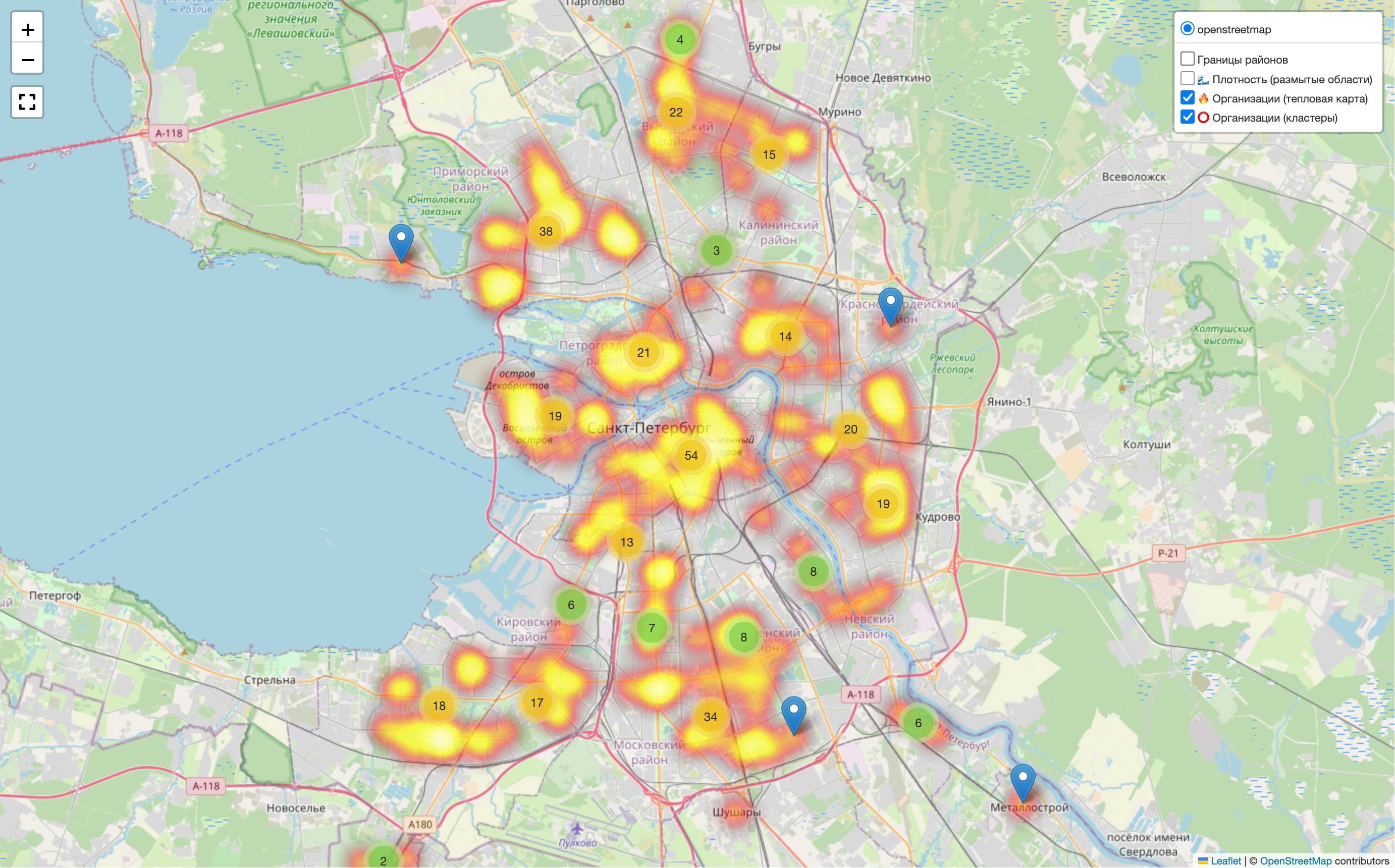
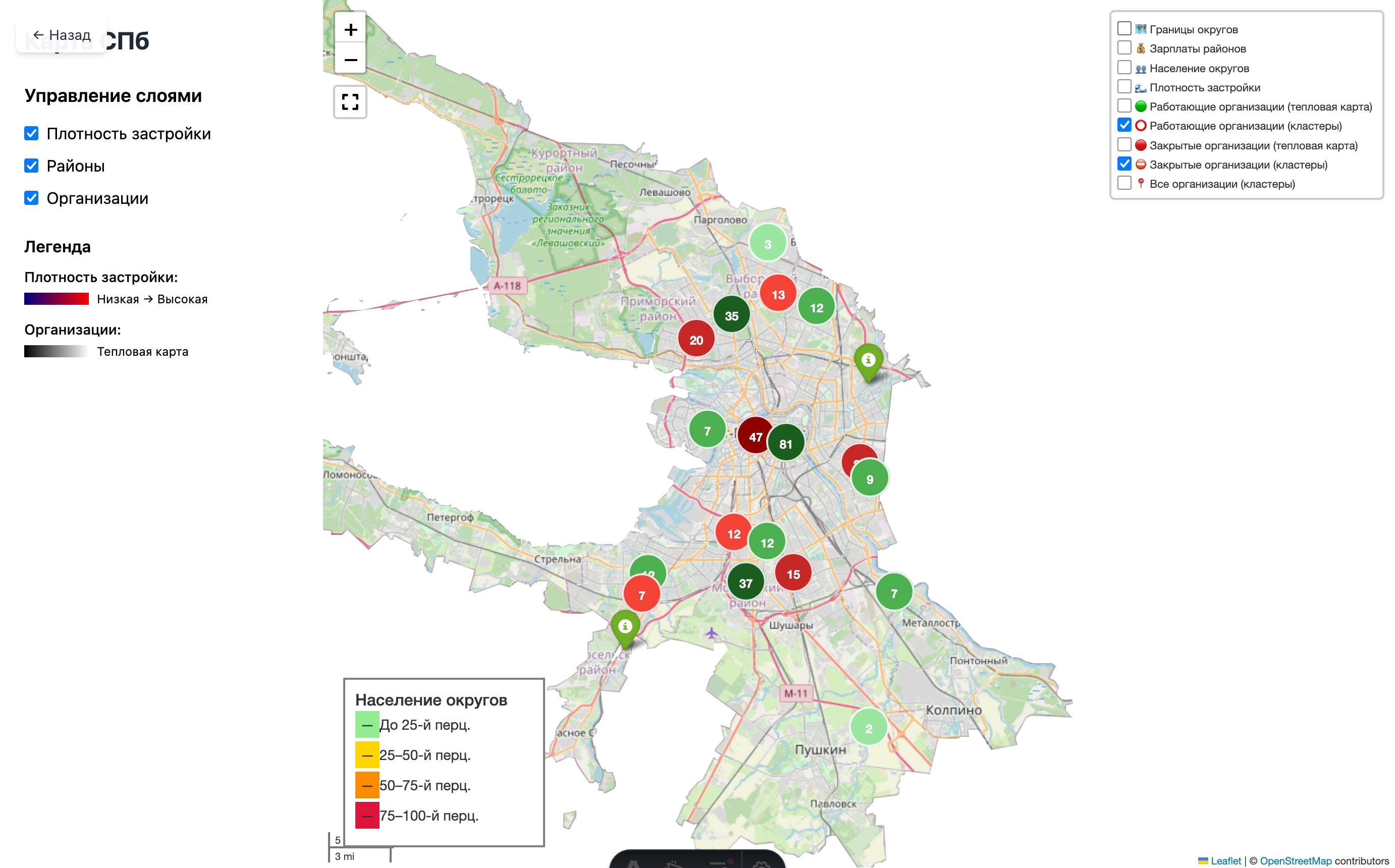
I started with the obvious thing: put all organizations on a map. But not just any map. I wanted it to be clearly inside Saint Petersburg. I found a GeoJSON boundary file on GitHub, and it helped a lot. Thanks to the author. On top of it, I added organization clusters, a heatmap, and a split between open and closed workshops.
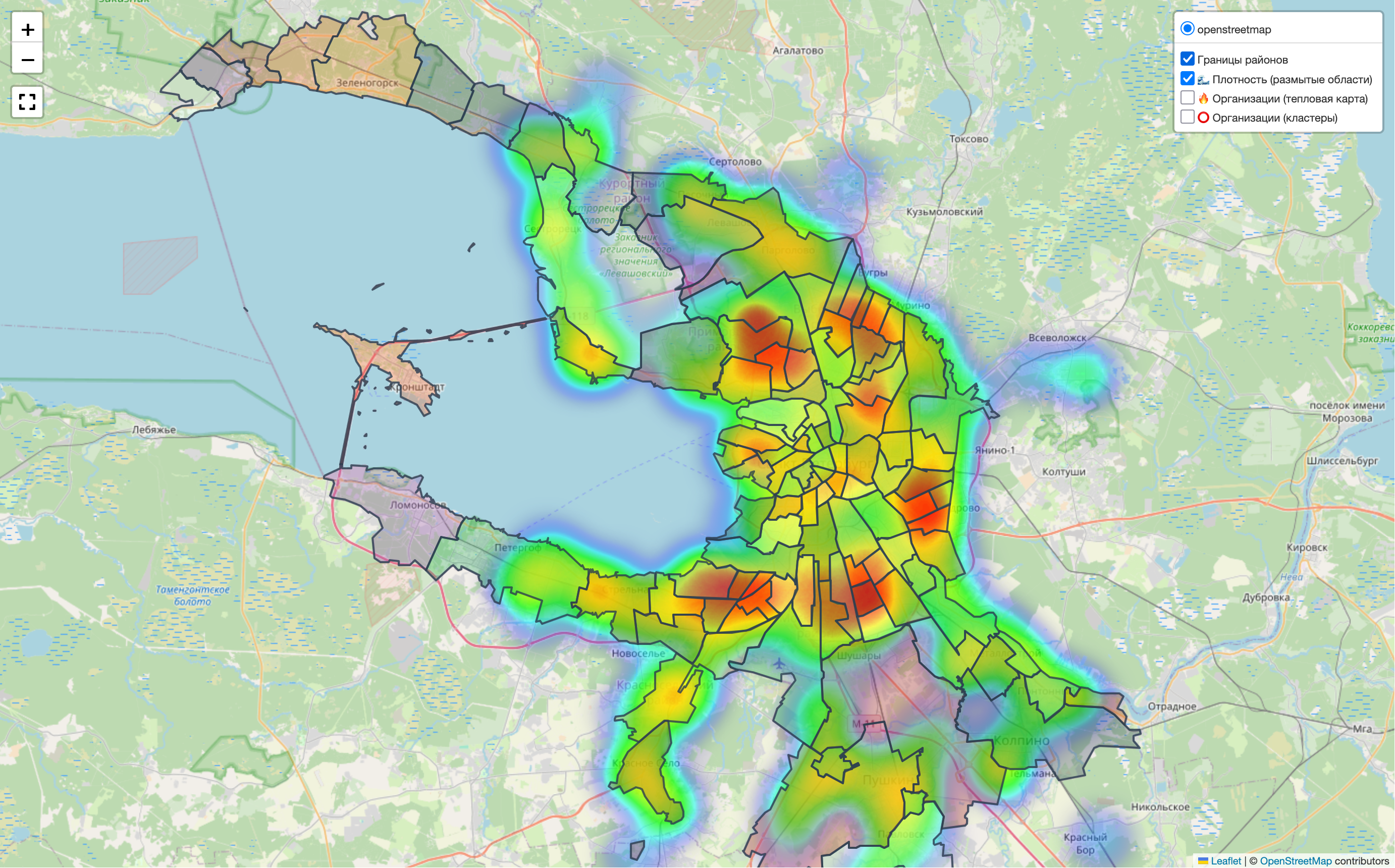
I also found building density data here, which could also be shown on the map. In the map legend, it appears under “Density.”
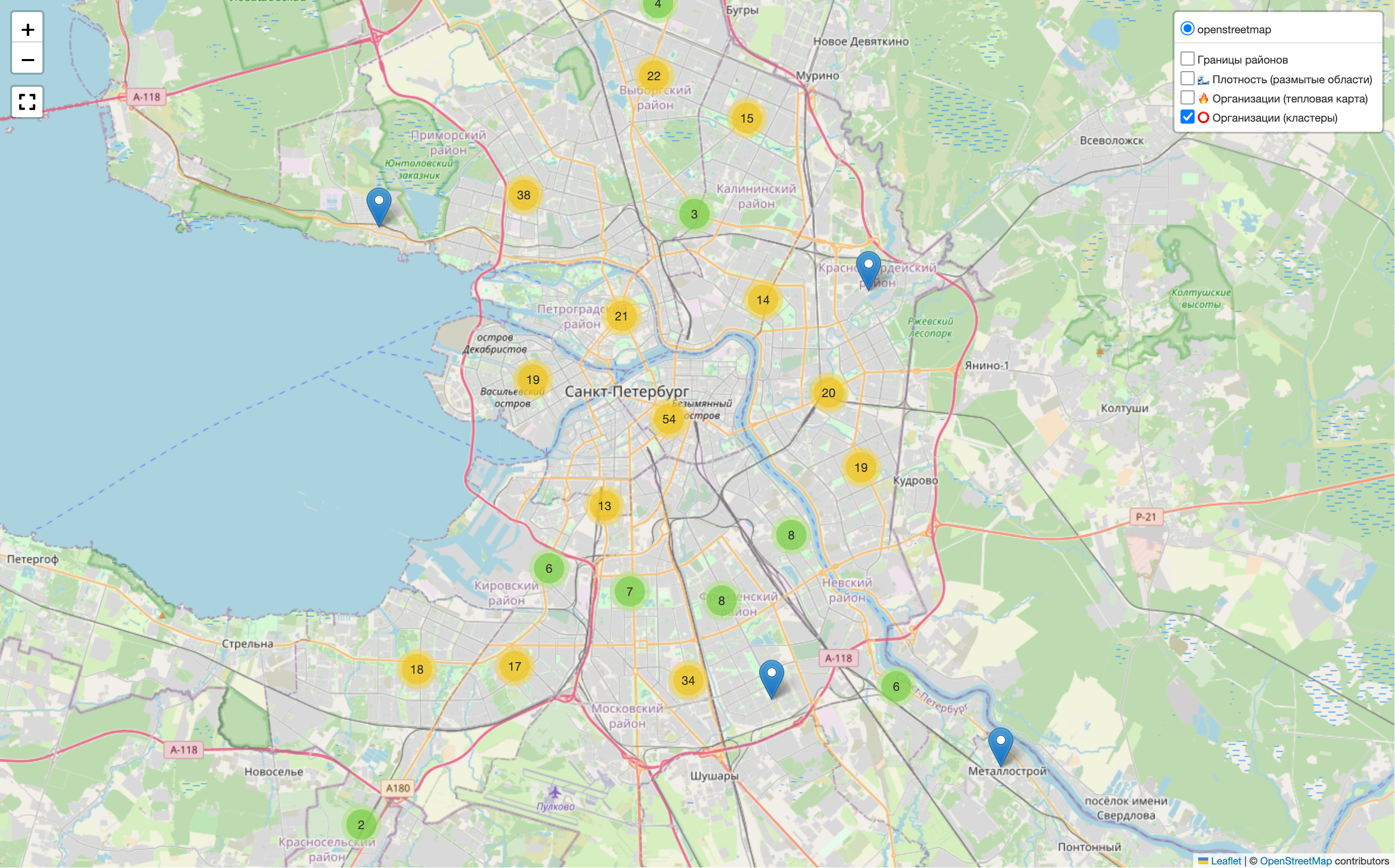
The map clearly shows concentration in the center and along main roads. But that was not enough for me. I wanted to split the city into districts and municipalities. Somewhere online I found boundary files for that, and I also decided to limit the view to Saint Petersburg only, without showing the whole world map. It would use fewer resources and look cleaner.
In the end, it is not very clear, especially with the heatmaps, but it does catch the eye.
To limit the visible area, I tried Plotly, Folium, KeplerGL, and looked at Mapbox. I settled on Folium. I did manage to crop the view, but not in the way I wanted. The full map still loads, and a mask is placed on top to hide everything outside the city boundary. When zooming, this is noticeable.
I got a bit sad and moved on.
Interactive Dashboard
If there is already a map, why not make a browser dashboard with controls and a legend, then package it as a small landing page with the research results?

And this is where I hit another problem. The script generates an HTML file with a Folium map, which I then embed into a dashboard through an iframe, essentially inside another HTML file. With that setup, I could not control the map from outside. I spent a day on it and realized I had not reached anything useful. Drawing the controls directly on the Folium map was also too painful for me. Styling there felt quite difficult.
I looked at the result and realized the dashboard idea did not make much sense. There are Google Sheets and Tableau for that. More importantly, I had drifted away from the goal.
I took a pause.
Visualization
Then I remembered that I had adapted pretty well to working with Plotly. So I thought: why not go back into visualization?
At that point, I worked only with Rosstat data, specifically population counts by districts and municipalities. Here is what came out:
Population change across Saint Petersburg districts and municipalities, 2018-2025
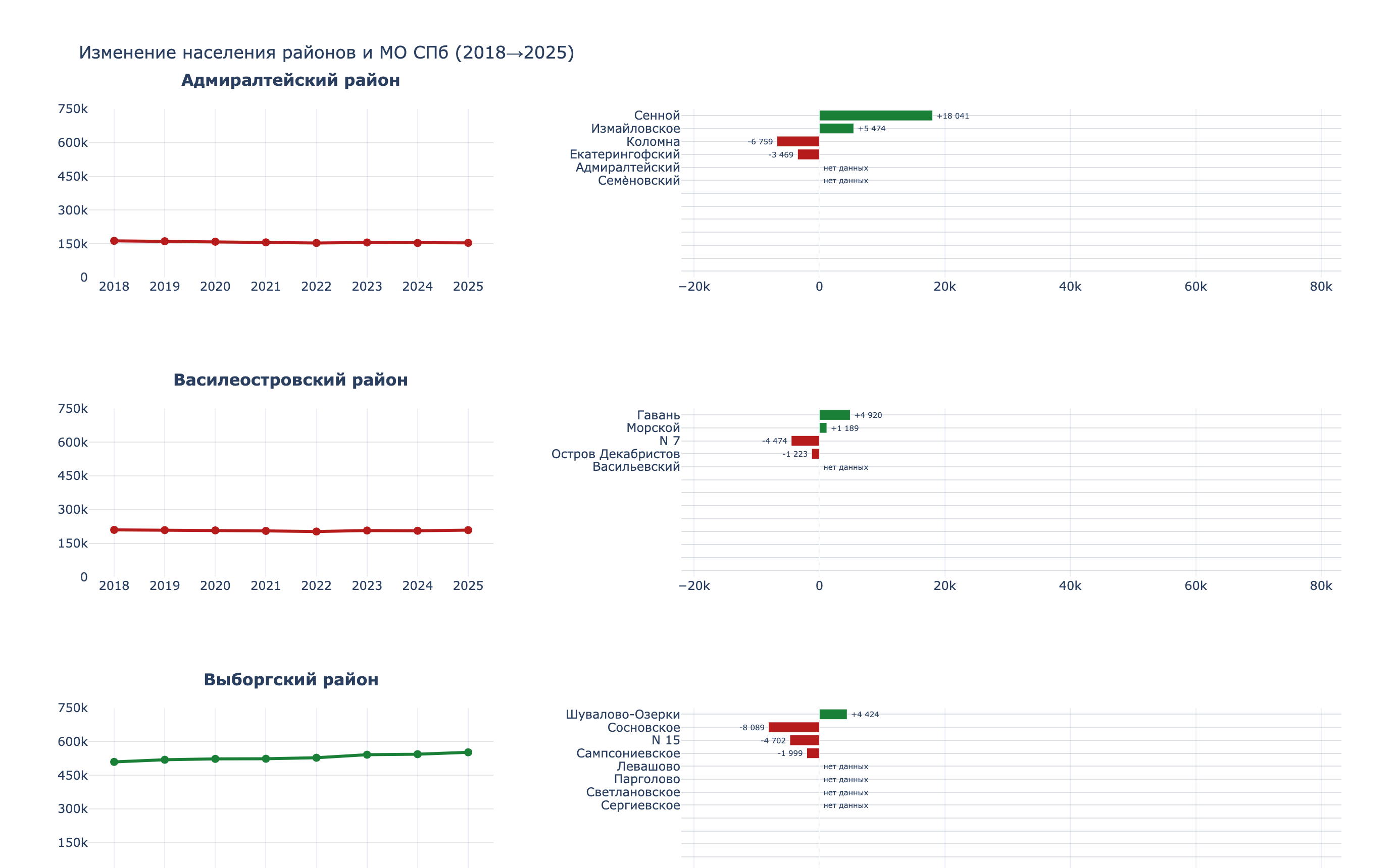
I am especially proud of this chart. The script, though, is painful to look at.
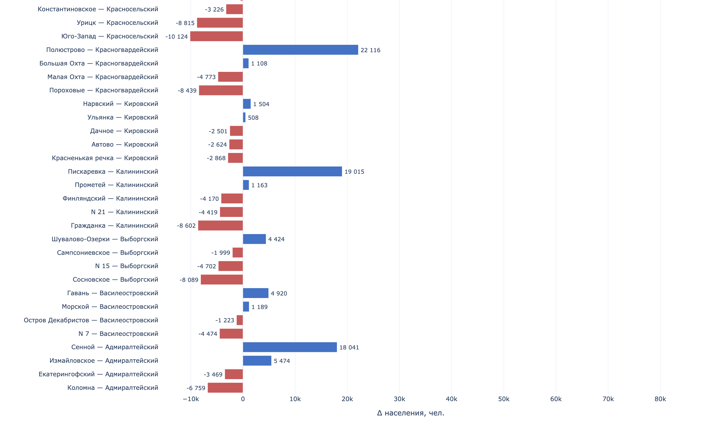
Population change by municipality in Saint Petersburg, 2018-2025
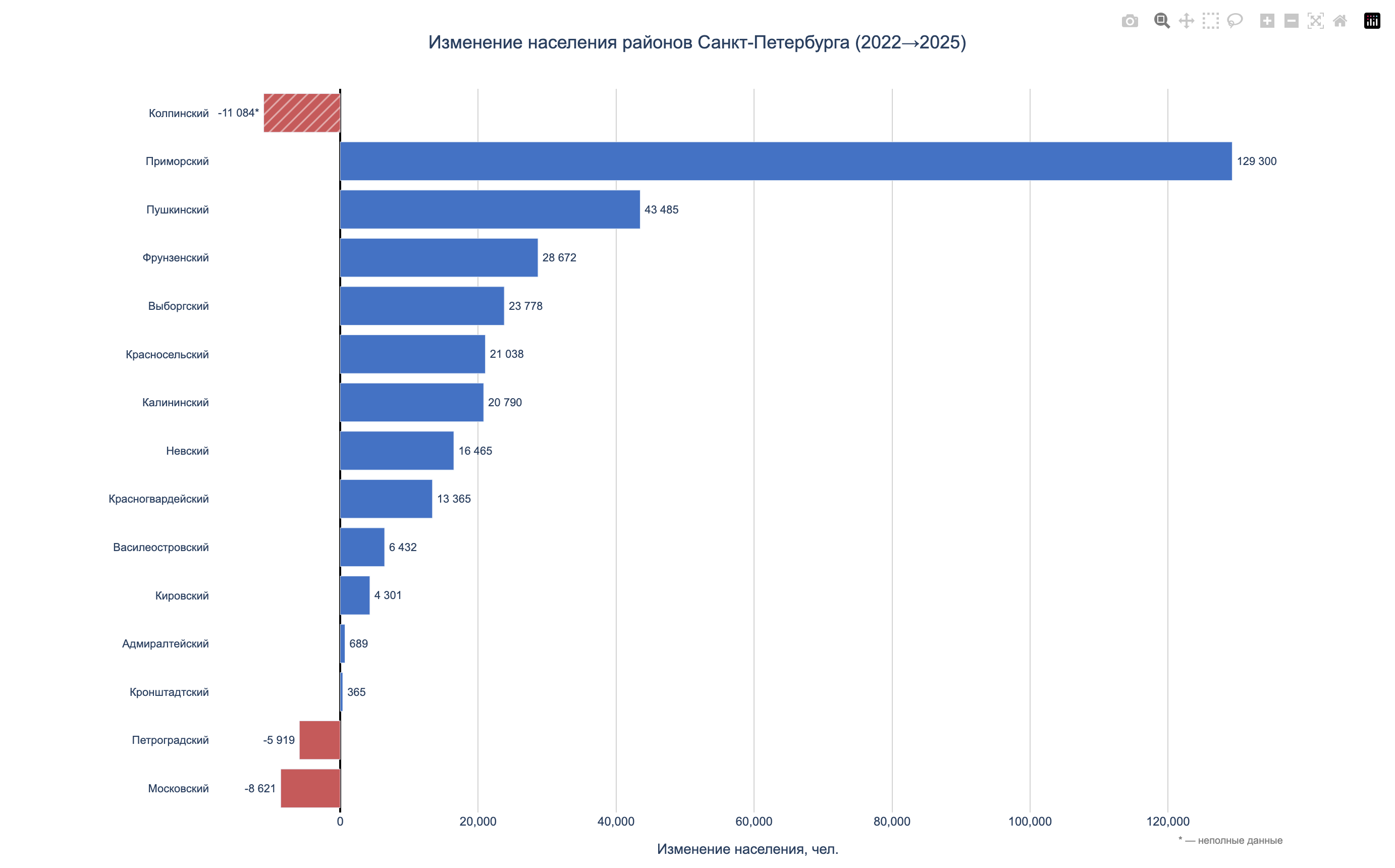
Population change by district in Saint Petersburg, 2018-2025
Compact view: district and municipality population
So yes, I tried different approaches. Some of it looked decent. Did I spend too much time? Of course. Did I hit another dead end? Also yes. But I did get some practice building charts. And again, I came to the conclusion that this was not scalable and not very reusable.
And there I was, back at square one. I had drifted away from the goal again. I got sad again.
I took another pause.
Part 2. From Chaos to Methodology
After the break, it became clear that the problem was not the tools. The problem was the lack of a plan. I was doing what I knew how to do, not what needed to be done.
Around the same time, I started taking the Google Data Analytics course. There I found a simple and powerful framework:
Ask -> Prepare -> Process -> Analyze -> Share -> ActThat was exactly what had been missing.

I decided to go back to the beginning and follow the steps properly.
What I Did Differently
Visitor profile.
Together with the “client,” we described visitor profiles: a general one, one for women, and one for men. This narrowed the search space a little.
Agreed stages.
My friend and I agreed on which stages were definitely worth doing, and which ones we simply did not have enough resources for within the current approach. That reduced the scope even more.
Organization.
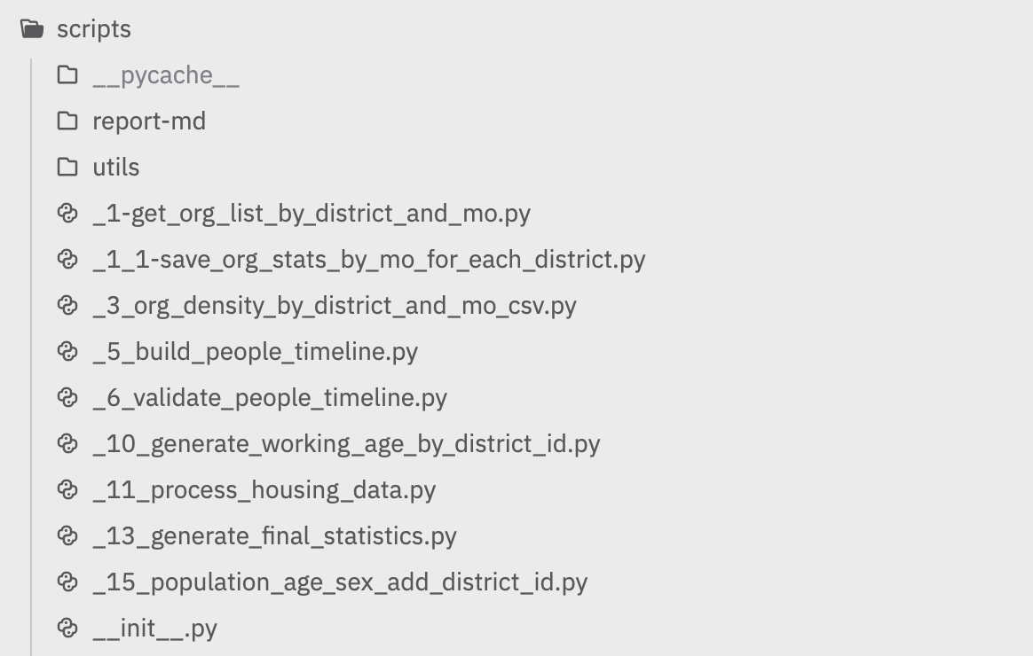
I removed unnecessary scripts and renamed the remaining ones in execution order. Each script got a description: which files it reads and which files it generates.
Data structure.
Before that, all scripts were just sitting in the scripts folder without any numbering. Finding them and telling them apart was not easy. The data folder was the same kind of mess.
In the new approach, I split things into:
source/(raw files from Rosstat and Yandex Maps)output/(final CSV files)report-md/(markdown reports)

Documentation.
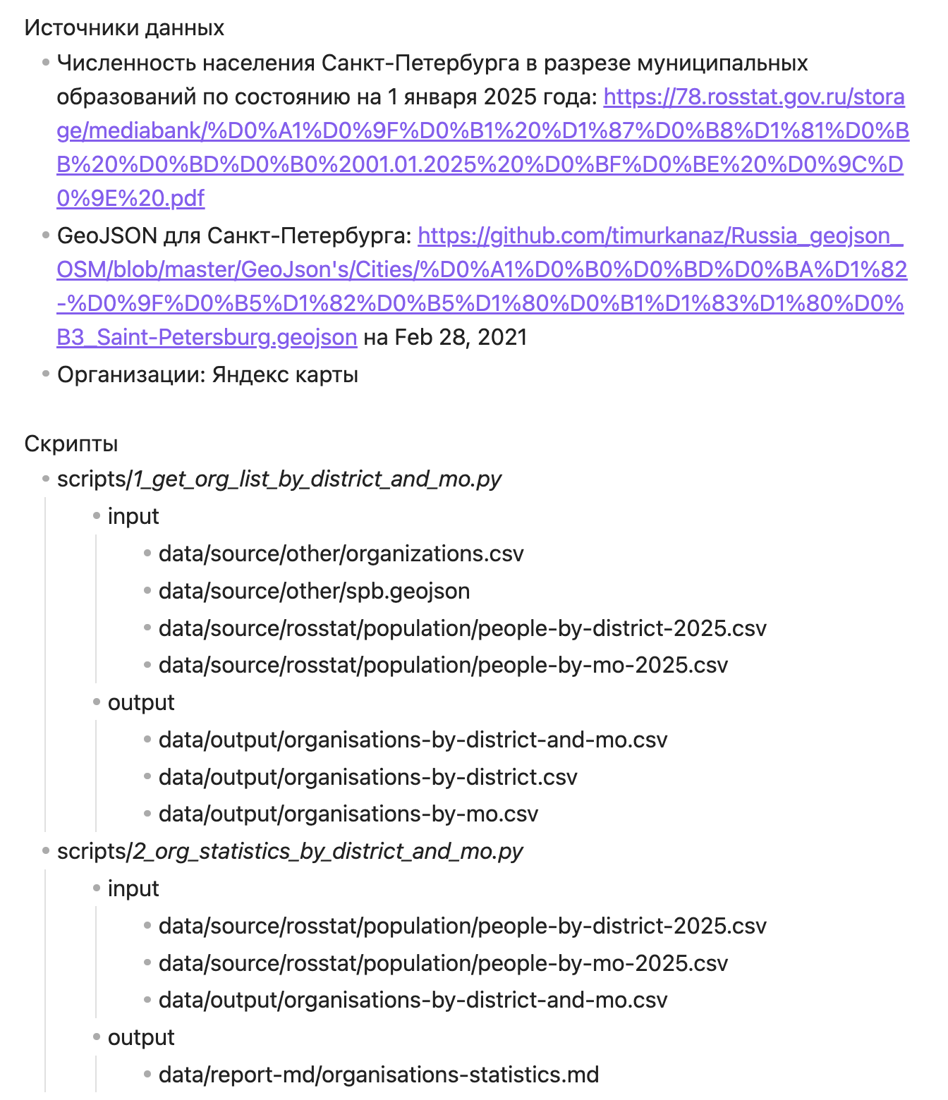
I started documenting data sources and supporting information for all produced results.
Following the first three stages of the framework helped structure the approach and create a real sequence for working with the data. Before the actual analysis, I spent quite a lot of time writing scripts, processing data, and documenting supporting information. But the result was worth it.
I ended up with a set of CSV files connected through a shared identifier. Those files could be loaded into Google Sheets or Tableau and analyzed right away.
Visualization
Instead of jumping straight into custom visualization, I first loaded all files into Google Sheets. I connected them, cleaned them up a bit, and made the first charts. That was enough to get a basic understanding of what I had and what could be done with it.
Visualizations in Google SheetsAfter making charts there, I later rebuilt them in Tableau as an experiment and as a way to learn the second tool. Still, Google Sheets turned out to be powerful enough for many calculations and visualizations.
Part 3. What the Data Showed
Once the pipeline started working, I had connected CSV tables with a shared unique id across four areas: competitive landscape, demographics, purchasing power, and infrastructure.
Competitive Landscape
The database contained 354 organizations. Of those, 219 were open (61.9%) and 135 were closed (38.1%). In other words, more than a third of workshops did not survive the market. Workshops existed in 15 of 18 districts. Three districts, Kronstadt, Kurortny, and Petrodvortsovy, had no workshop at all, even though their combined population was 264,000 people.
The largest number of workshops was in Primorsky (39), Central (37), and Nevsky (34). At the same time, Primorsky had the worst survival rate among large districts: only 48.7% of workshops were still open, the rest were closed. For comparison, the survival rate was 76% in Kirovsky and 74% in Kalininsky.
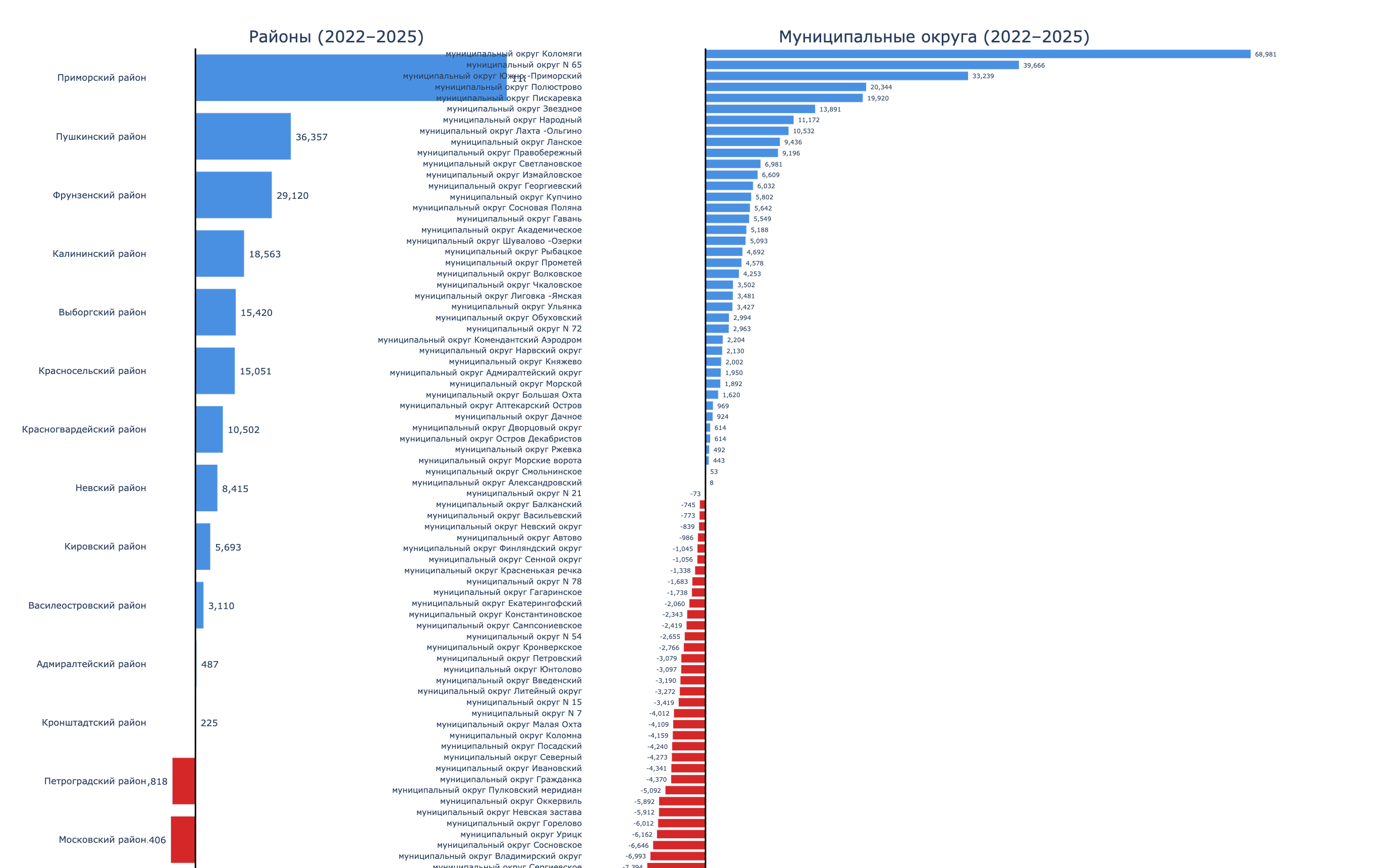
But the number of workshops alone does not say much. What matters more is how many residents there are per workshop. This metric shows competitive pressure: the more people per workshop, the lower the competition.
The range was huge. In Kolpinsky, there were 190,000 residents per workshop, practically a monopoly. In Pushkinsky, 69,000. In Primorsky, 37,000. In Central and Petrogradsky, fewer than 10,000 people per workshop, which means the market is saturated.
At municipality level, the picture was even more contrasting. These were the “blank spots”: municipalities with large populations and zero workshops.
| Municipality | District | Population |
|---|---|---|
| Kolpino | Kolpinsky | 147,179 |
| Kolomyagi | Primorsky | 122,082 |
| Pushkin | Pushkinsky | 108,969 |
| Svetlanovskoe | Vyborgsky | 90,456 |
| Peterhof | Petrodvortsovy | 81,767 |
| Lanskoe | Primorsky | 70,883 |
| Krasnoe Selo | Krasnoselsky | 61,162 |
| South-West | Krasnoselsky | 58,269 |
In the center, the story was the opposite. In municipality “No. 78” in the Central District, there were only 2,986 people per workshop. On Aptekarsky Island, 3,515. Competition there was at its highest.
Demographics
Population data for 2018-2025 showed two opposite trends. Some districts were actively growing because of new housing, while others were steadily losing residents.
The growth leaders were Pushkinsky (+32.9%, adding 69,000 people over 7 years), Primorsky (+26.4%, +149,000), and Krasnoselsky (+15.1%, +58,000). On the other end were Petrogradsky (-12.3%), Central (-10.5%), and Admiralteysky (-5.6%).
At municipality level, growth inside growing districts was uneven. For example, in Primorsky District, Kolomyagi grew by 163%, Lakhta-Olgino by 263%, while Ozero Dolgoe lost 7%. In Krasnoselsky, Yuzhno-Primorsky grew by 73%, while South-West and Uritsk each lost 15%.
From the 2024 age structure, I pulled out the target audience: people aged 30-65. These are the main customers for repair workshops: working people who own jewelry and need maintenance.
The largest target audience was in Primorsky (379,000 people aged 30-65), Nevsky (293,000), Kalininsky (281,000), and Vyborgsky (279,000). The smallest was in Kronstadt (22,000) and Kurortny (43,000).
I also looked separately at the working-age female audience. Women visit jewelry workshops more often and often bring several items in one visit.
In absolute numbers, Primorsky led with 216,000, followed by Kalininsky (166,000) and Nevsky (164,000). The share of working-age women in the total district population was fairly even: from 27% to 31% across all districts, without obvious outliers.
Purchasing Power and Infrastructure
Average salary by district means salaries at companies registered in that district, not the income of residents who live there. Even with that caveat, the spread was noticeable: from 108,531 rubles in Krasnoselsky to 166,640 rubles in Primorsky.
The upper-right quadrant is the most interesting: higher salary and lower competition. The lower-left is the least attractive.
Several districts stand out high on the Y-axis. That means very high people per workshop, or in plain language, especially low workshop coverage.
Districts farther to the right have higher income levels.
The most promising points are closer to the upper-right corner, especially if the bubble is also large, meaning a larger market.
One interesting observation: high salary does not correlate with the number of workshops. Moskovsky District (163,332 rubles) and Primorsky (166,640 rubles) lead by salary. But Moskovsky is oversupplied with workshops: 21 workshops for 334,000 people, or about 16,000 people per workshop. Primorsky is not: 19 workshops for 715,000 people, or about 38,000 people per workshop.
For housing commissioning in 2021-2023, Primorsky was the absolute leader with 2,479 thousand square meters, followed by Vyborgsky (1,384) and Nevsky (1,008). This is an indirect indicator of new population inflow in the coming years.
For comparison, Kirovsky commissioned only 37 thousand square meters over three years, and Kalininsky 40 thousand. These districts have been built up for a long time, so the inflow is minimal.
So the data drew a general picture: an oversaturated center, growing outskirts with low competition, and “blank spots,” large municipalities without a single workshop. The remaining step was to turn this into a numerical model.
Part 4. Scoring Model
I developed the criteria together with Claude. After several iterations, we arrived at the following model.
District and municipality selection criteria
Two-Stage Model
Stage 1 - district ranking (7 criteria, total weight 70%):
| Group | Criterion | Weight |
|---|---|---|
| Competition | Residents per workshop | 20% |
| Competition | Survival rate | 5% |
| Demographics | Target audience size (30-65 years old) | 15% |
| Demographics | Share of working-age women | 5% |
| Demographics | Population growth 2018-2025 | 10% |
| Income | Average salary | 10% |
| Infrastructure | Housing commissioned in 2021-2023 | 5% |
Data coverage was 70%. The remaining 30%, traffic, transport accessibility, and similar factors, could not be calculated because the data was missing. We decided not to focus on that.
Stage 2 - municipality ranking inside the top districts by competitive pressure and “blank spots,” meaning municipalities with population above 50,000 and zero workshops.
Scoring Results
Top 5 districts by final score:
| Rank | District | Score | Key factors |
|---|---|---|---|
| 1 | Primorsky | 2.57 | Low competition, largest target audience, active growth |
| 2 | Pushkinsky | 2.43 | Very few competitors, record growth (+33%) |
| 3 | Vyborgsky | 2.36 | Balance of population and competition |
| 4 | Krasnoselsky | 2.29 | Few workshops, growing district |
| 4 | Kalininsky | 2.29 | High business survival rate |
At municipality level, several “blank spots” stood out: large-population municipalities with zero workshops, such as Kolomyagi (122,000), Pargolovo (116,000), Krasnoe Selo (61,000), and South-West (58,000).
Part 5. Why the Report Does Not Solve the Task
I sent the results to my friend.
He showed them to the person we were trying to help. The reaction was: “Interesting, but I still hold my original opinion.” And I understand him.

What Is Wrong with the Model
The report does not account for the specifics of the business. If we replaced “jewelry workshop” with “hair salon,” the result would be roughly the same. The model works mostly at the demographic level.
There is too little data for a real decision. The model lacks pedestrian and car traffic, which are key factors in professional location models; rent by location; proximity to complementary businesses, such as malls and wedding salons; and median household income. Average salary by district companies is not the same as the income of people who live in that district.
The sample size distorts the metrics. Each district has between 1 and 39 workshops. Closing two or three locations shifts the survival rate by 10-15%, which reflects the circumstances of specific people more than the properties of the district.
The model coverage is 70%. That is enough for a rough filter from 18 districts to 8. It is not enough to choose a specific address.
What I Took Away
Process Mistakes
Visualization before analysis. Several times I went into nice charts and maps before I had formulated the question. I was doing things not to reach the goal, but to try building them. In total, I spent about a month on code that I did not use later.
No plan. Without a methodological framework and a clear plan, it is very easy to do the wrong thing. For example, only halfway through I discovered that Rosstat data for different years did not quite match. It turned out that two municipalities had been renamed, which caused the mismatch.
Blind research. It is fine when you already have a ready dataset. But spending time blindly when the data still has to be collected and processed, while the goal and questions are not defined, is a bad deal.
Data organization. Without a clear hierarchy and organization for scripts and data, it is very easy to end up in chaos that is easier to throw away and start over. That said, this kind of messy approach sometimes helps me understand how to do it better next time.
The “dream project.” Instead of artificially creating a huge project, it is better to focus on small, doable stages. Otherwise, the dream project mostly leaves you tired and wanting to stop working on it.
What Worked
Working methodology. Once I built the pipeline (script -> CSV -> Google Sheets -> visualization), the work became much faster. I finally understood where I was going and what each step was for, instead of exploring blindly.
Documentation. Documentation played an important role in understanding what was happening in the scripts and in the resulting data. Every time I returned after a long pause, it helped me get back into context.
Iterations with pauses. Breaks of 1-2 weeks were more useful than continuous work. After each break, I returned with a new understanding of the task. The realization that I was doing the wrong thing usually came during those pauses.
The project took about 8 months of spare-time work. Python code, visualizations in Google Sheets and Tableau. All data came from open sources.